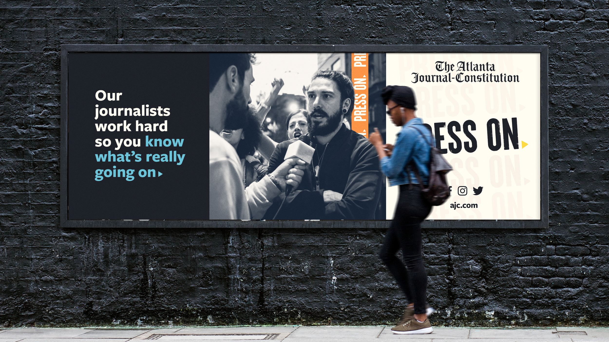
Rebranding The Atlanta Journal-Constitution
In the midst of its corporate rebrand, The Atlanta Journal-Constitution wanted to rethink its email strategy and develop a new approach to dynamic, modular email design.
Through stakeholder interviews with reporters, designers, developers, and marketers, I identified customer use cases that outlined a personalized content roadmap. My goal was to increase trust in the brand and allow them to send unique and relevant messages to each customer at the time of open.
To do this, I built a rebranded, accessible email experience that aligned across digital touchpoints. This resulted in an open design system for all collaborators and stakeholders. Branding assists and guidelines are shared through Adobe XD for studio teams and Iterable for reporters. It’s easy to use and easy to scale, which made adoption seamless for all stakeholders.
The Rebrand
The Atlanta Journal-Constitution released their new logo, value prop, tagline, and style of photography.
Since 1939, The Atlanta Journal-Constitution has been the paper of the city, unpacking the issues driving the national conversation on social justice, and they’ve protected democracy from a tidal wave of disinformation.
They sought to unify all products under a single brand, and highlight the work of journalists with one mission: Press On. This new mission extends across print, digital, social, email, and other channels, focusing on the value of real, fact-based journalism across the board.
Click here to read the “Press On” mission statement.
-
Customers have a variety of interests to subscribe to on AJC.com and can set their email preferences for topics easily. But, promotional messages are targeted to specific audiences, however, the entire audience selected gets the same message. There is no accommodation for the different kinds of preferences a customer has with their existing free accounts with the AJC.
Additionally, accessibility and email design best practices and consistency could use an overhaul.
Finally, rework the visual aesthetic to reinforce that the AJC is in Atlanta for Atlanta.
-
Through stakeholder interviews, we were able to immerse ourselves in their process and gain a more in-depth understanding of their program. We mapped the various communication touchpoints, identifying key use-cases.
-
We were able to create a rebranded, accessible customer experience across digital touchpoints.
The design system is open to all collaborators and stakeholders shared through designs in Adobe XD for studio teams and Iterable for reporters.
It’s easy to use and easy to scale, which made adoption seamless for all stakeholders.
The Email Design System
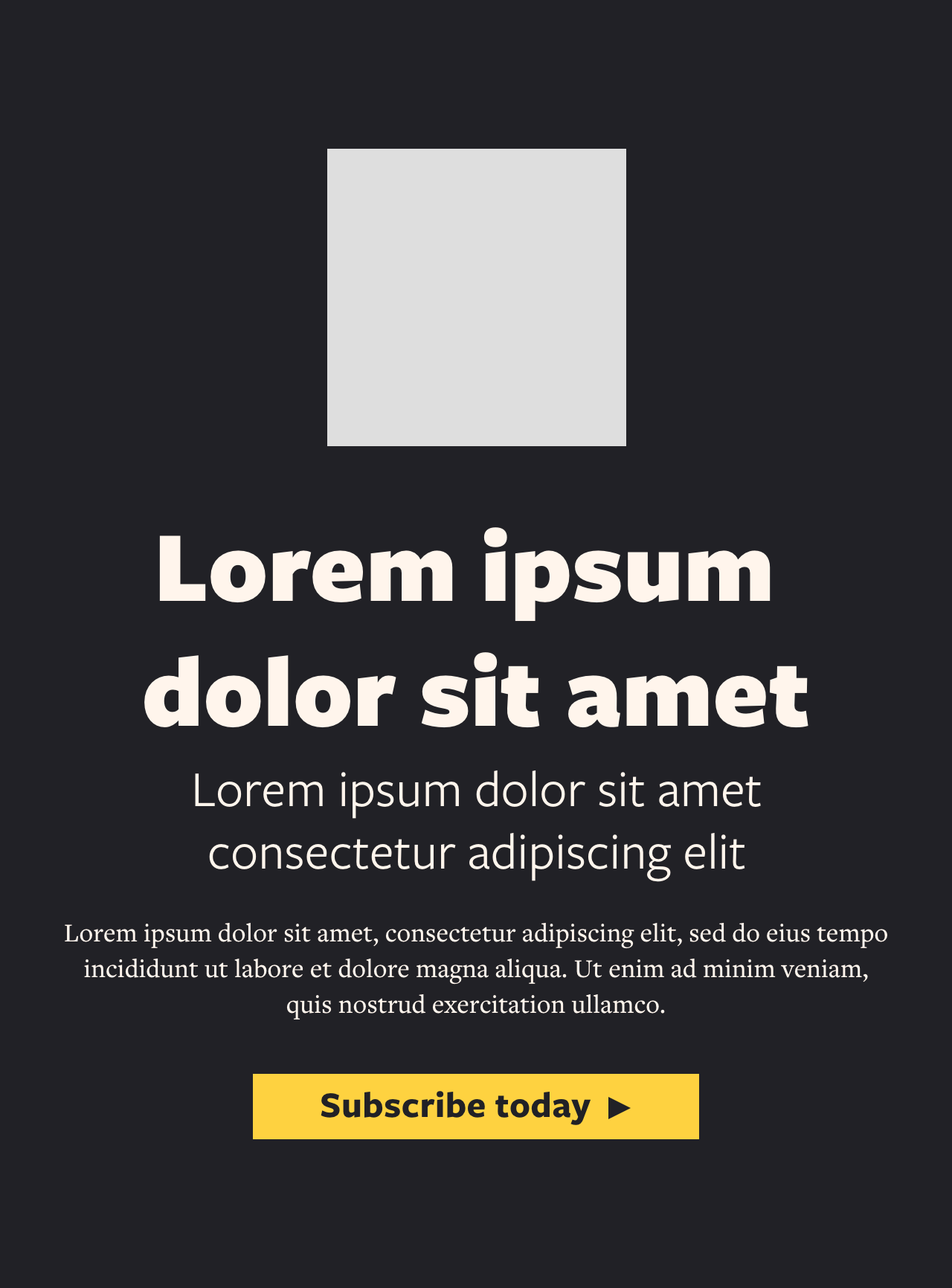
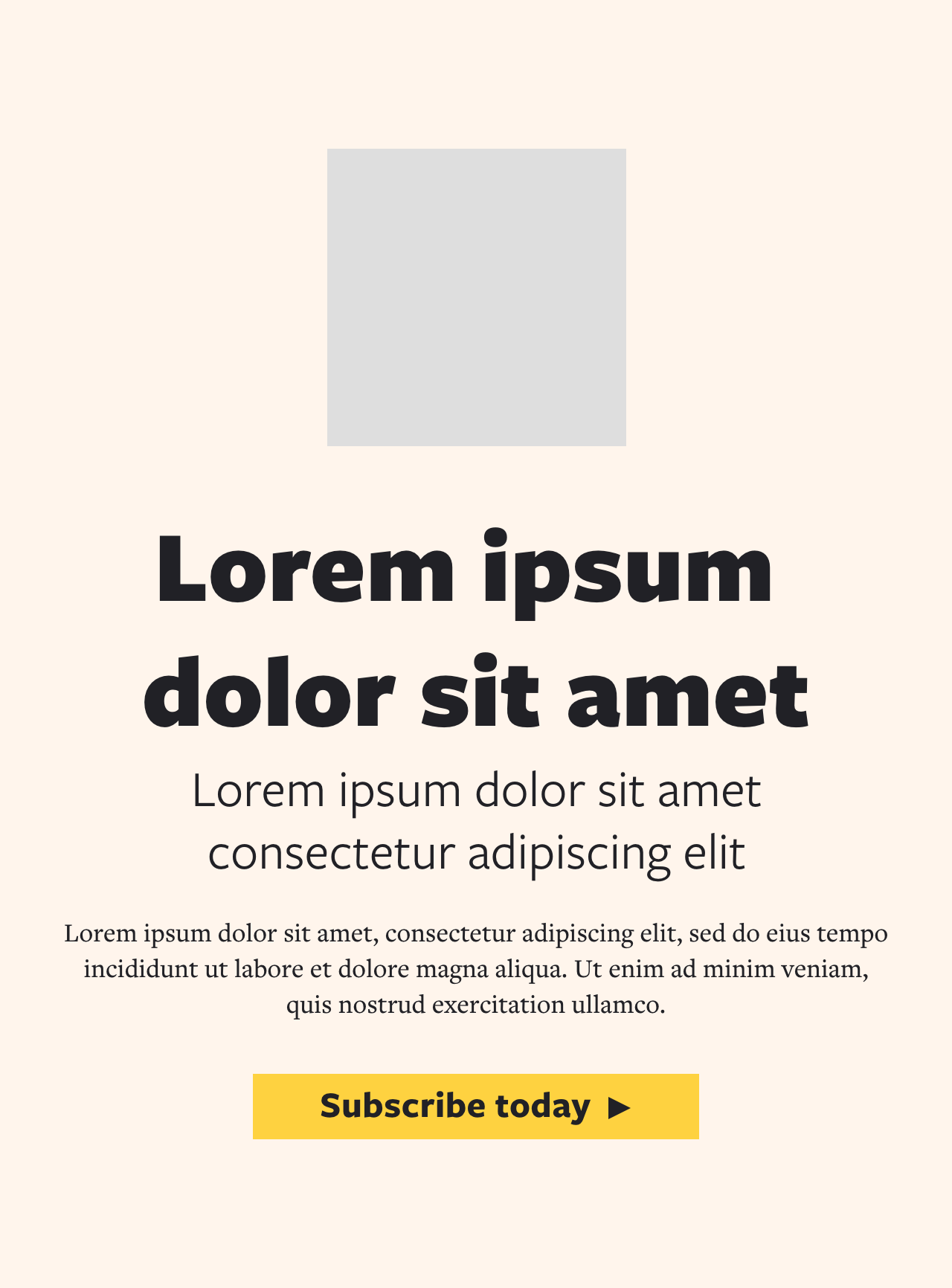
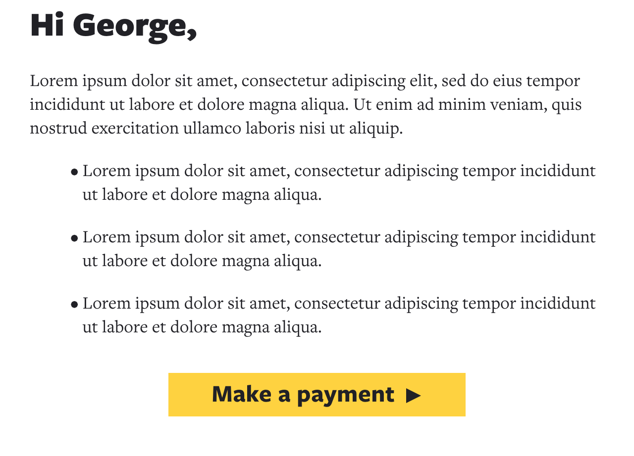
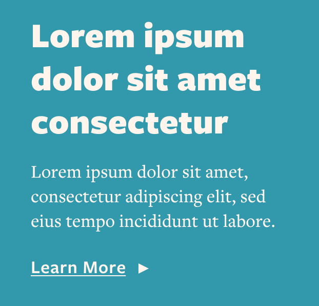
Template Examples.
A responsive, modular email design system that can generate messages for multiple audiences, by multiple stakeholder groups, with one dynamic send.
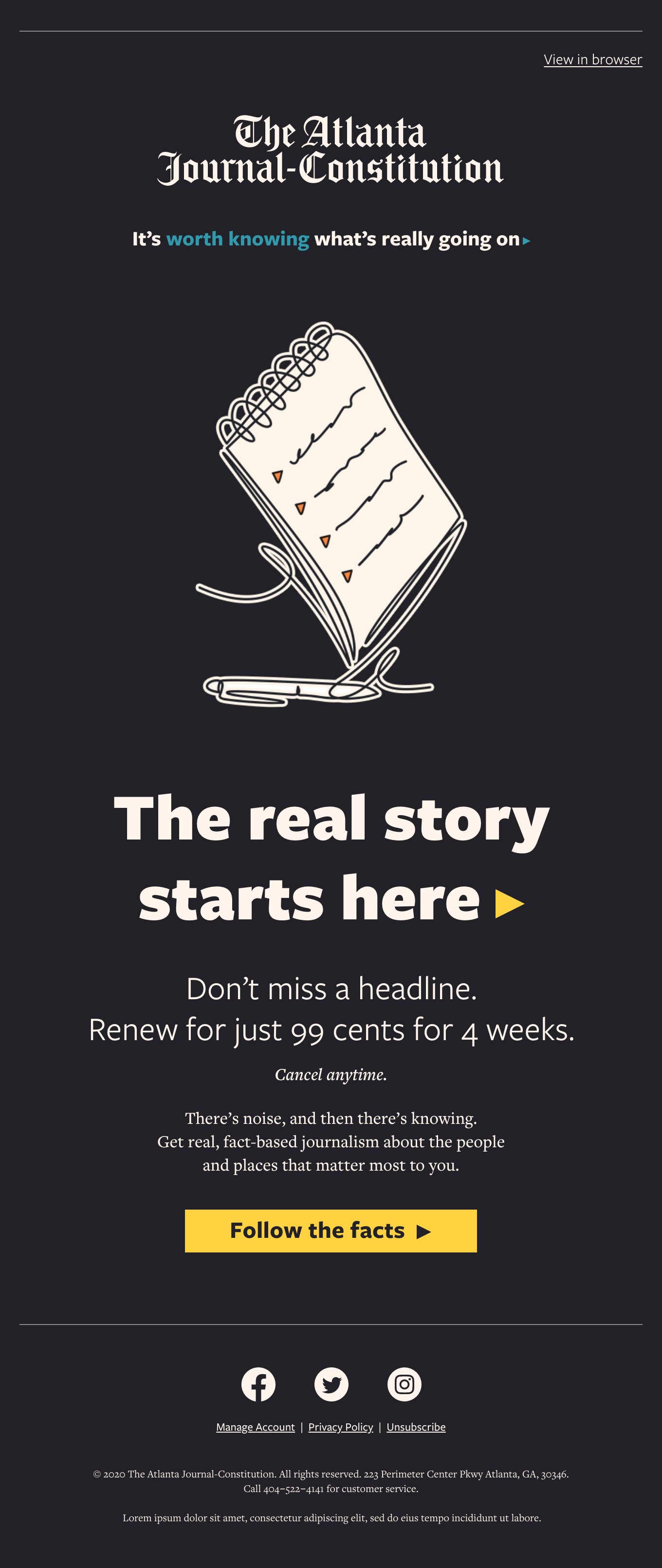
Winback email in charcoal, mockup
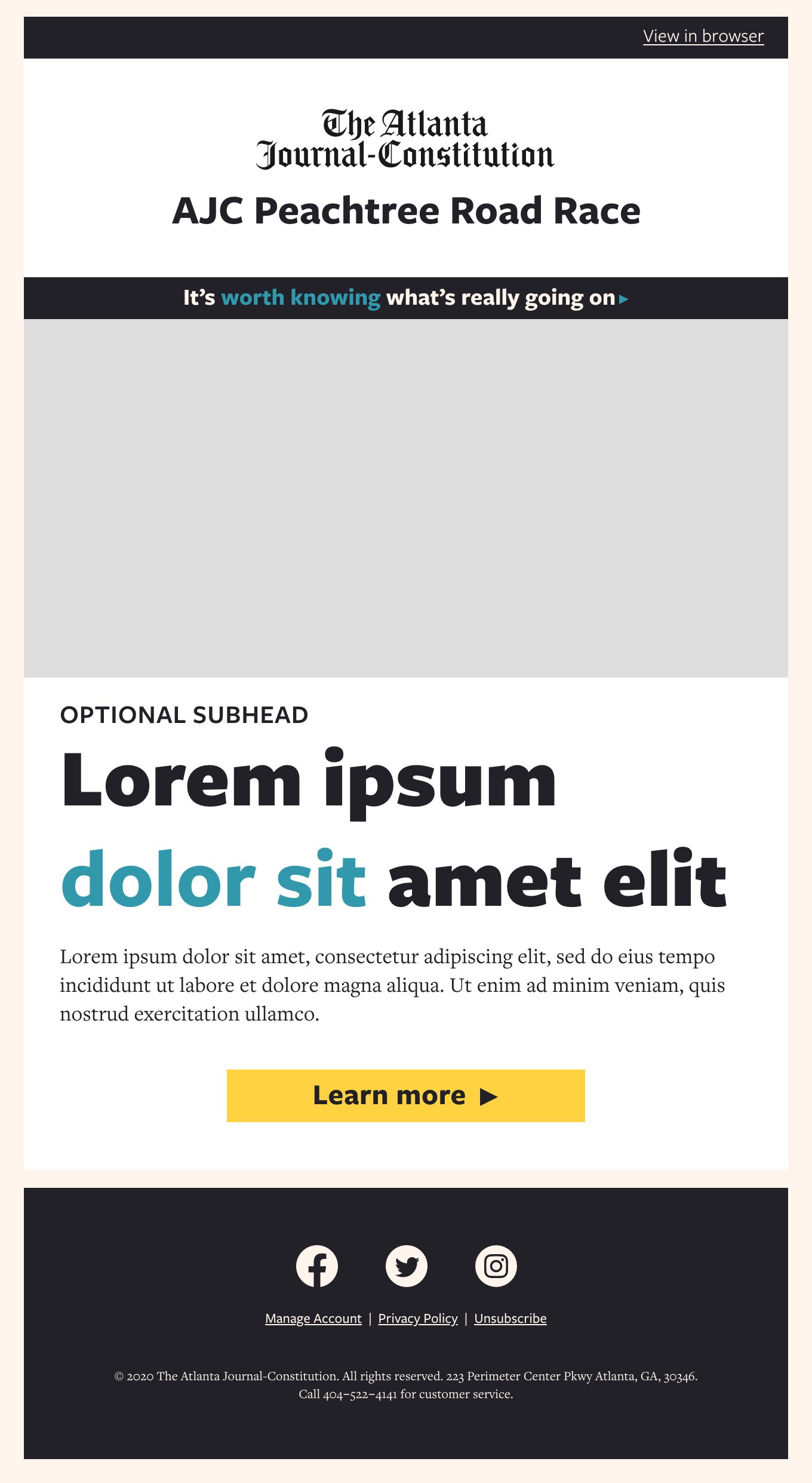
Free Newsletter Welcome email
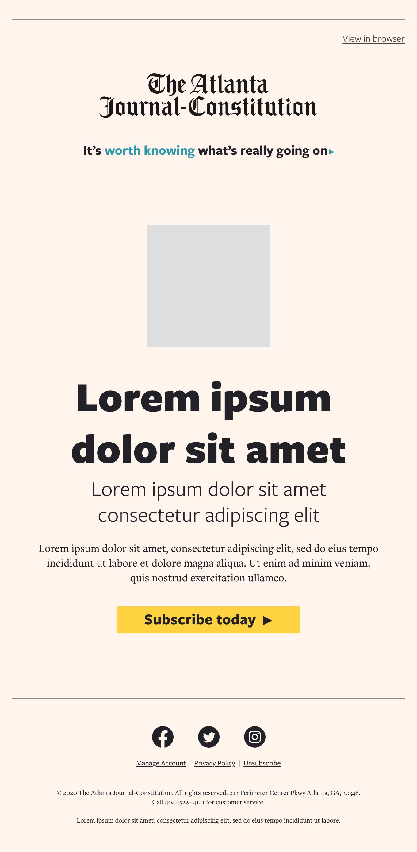
Winback email in cream
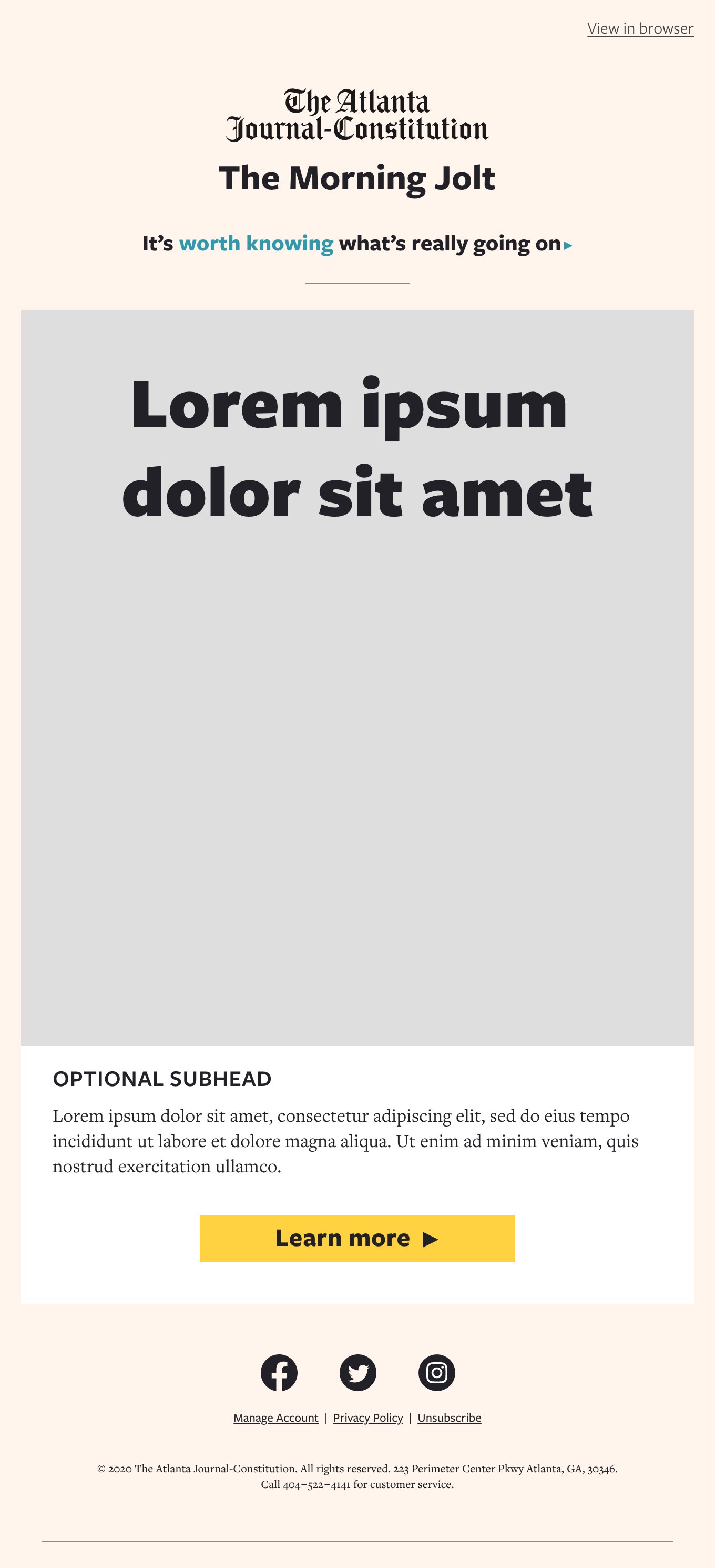
Paid Newsletter Welcome email

Promotional email for lapsed paid subscribers
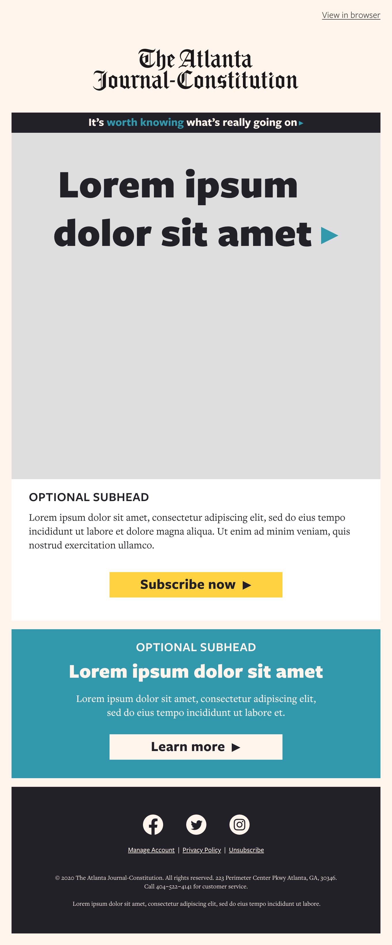
Promotional targeted paid offer
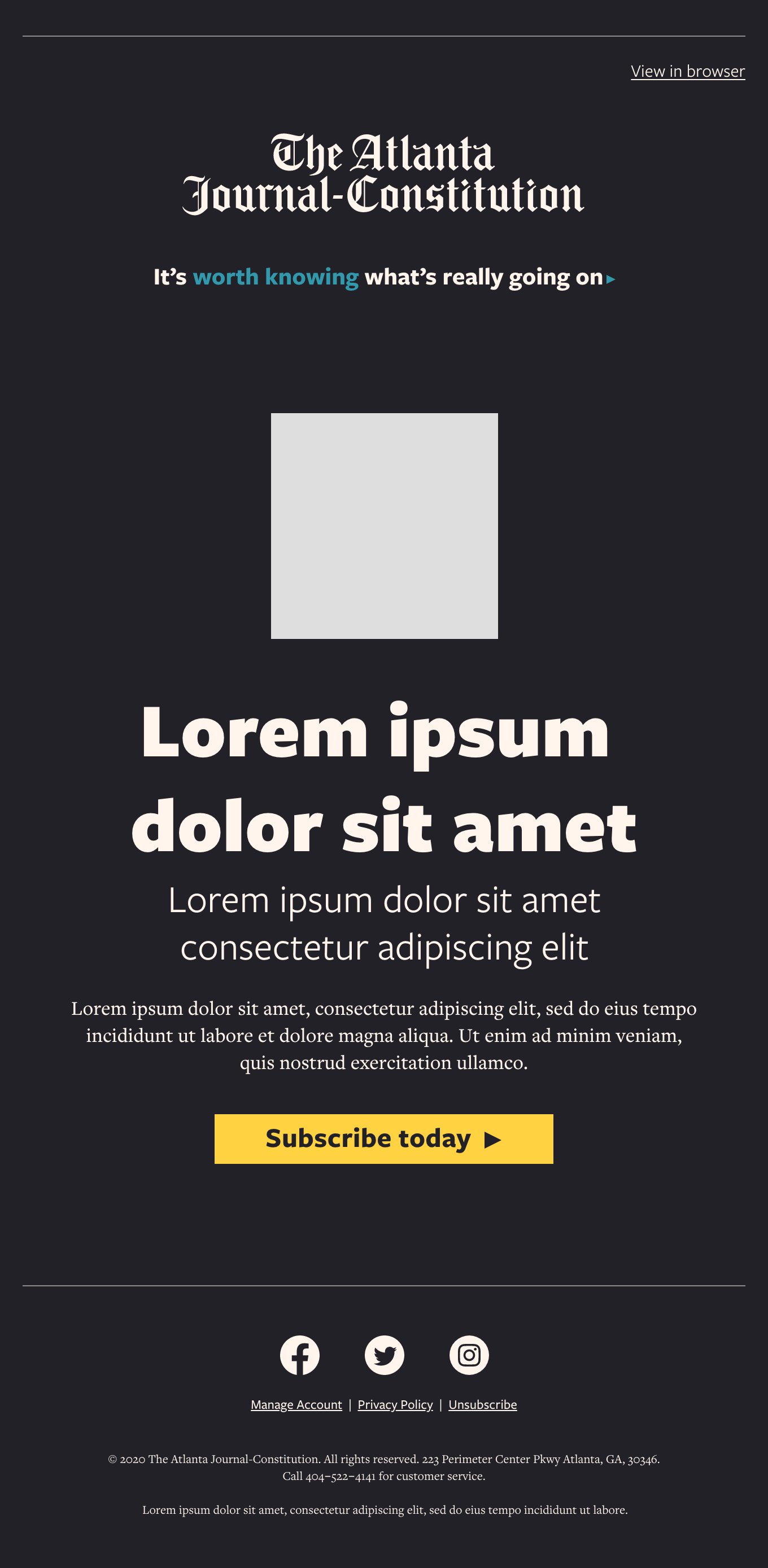
Winback email in charcoal
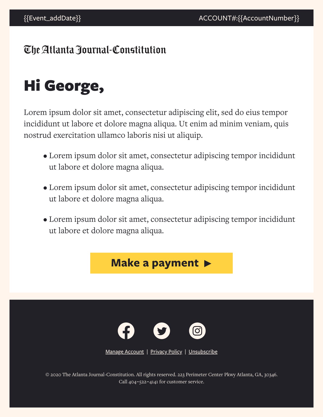
Transactional email
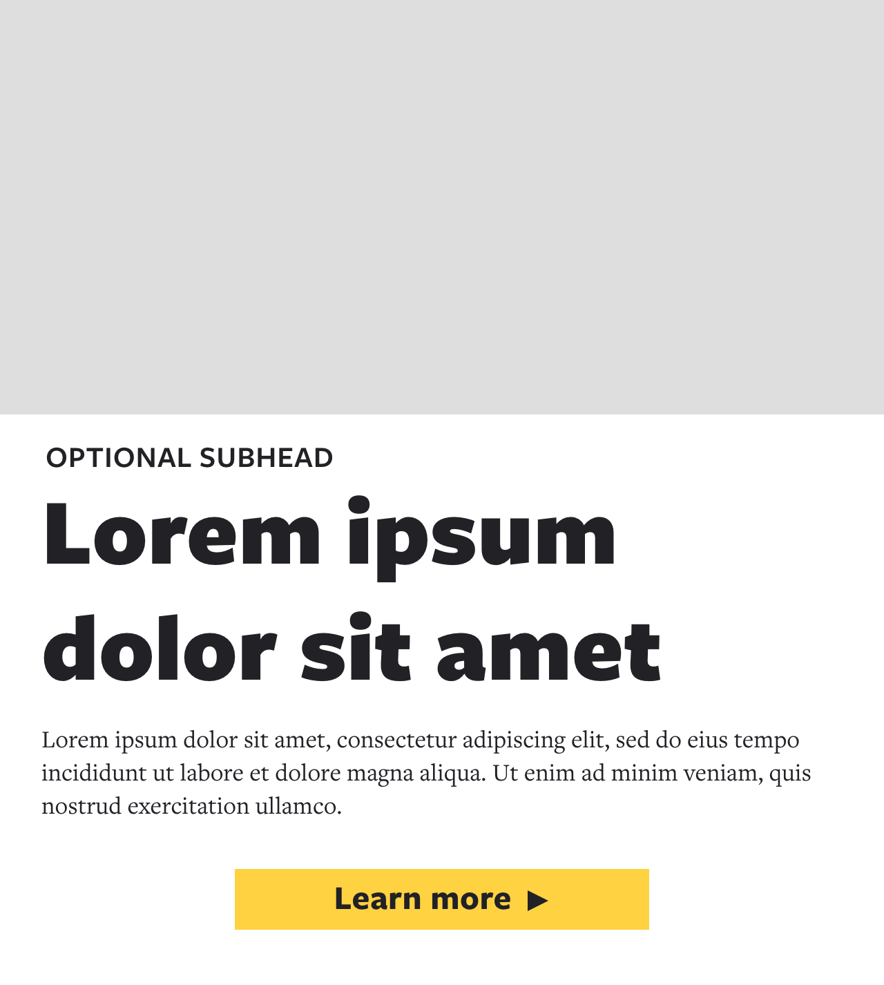
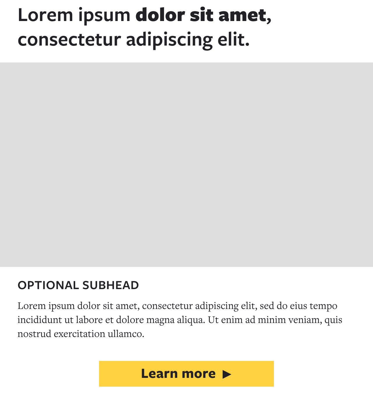
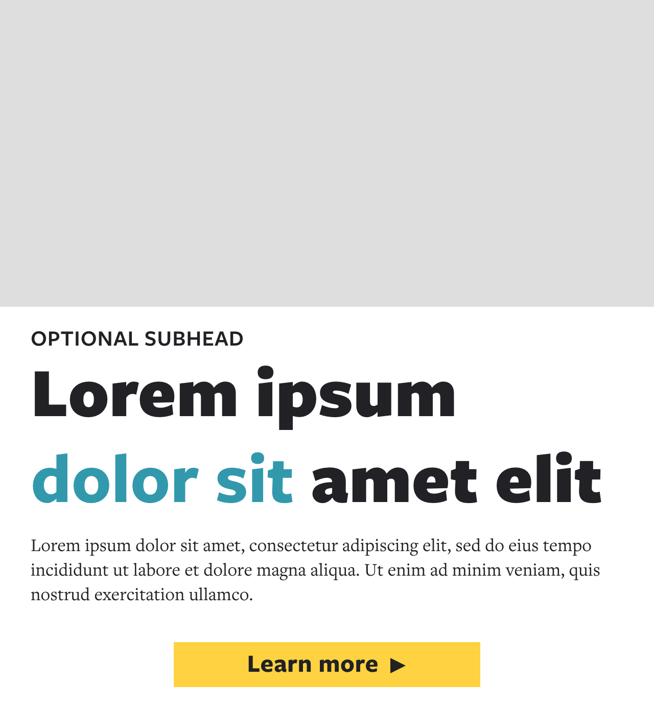
Template Modules.
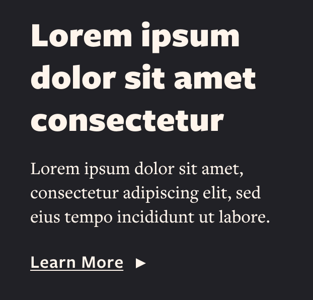
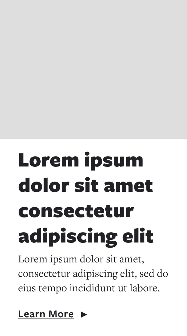
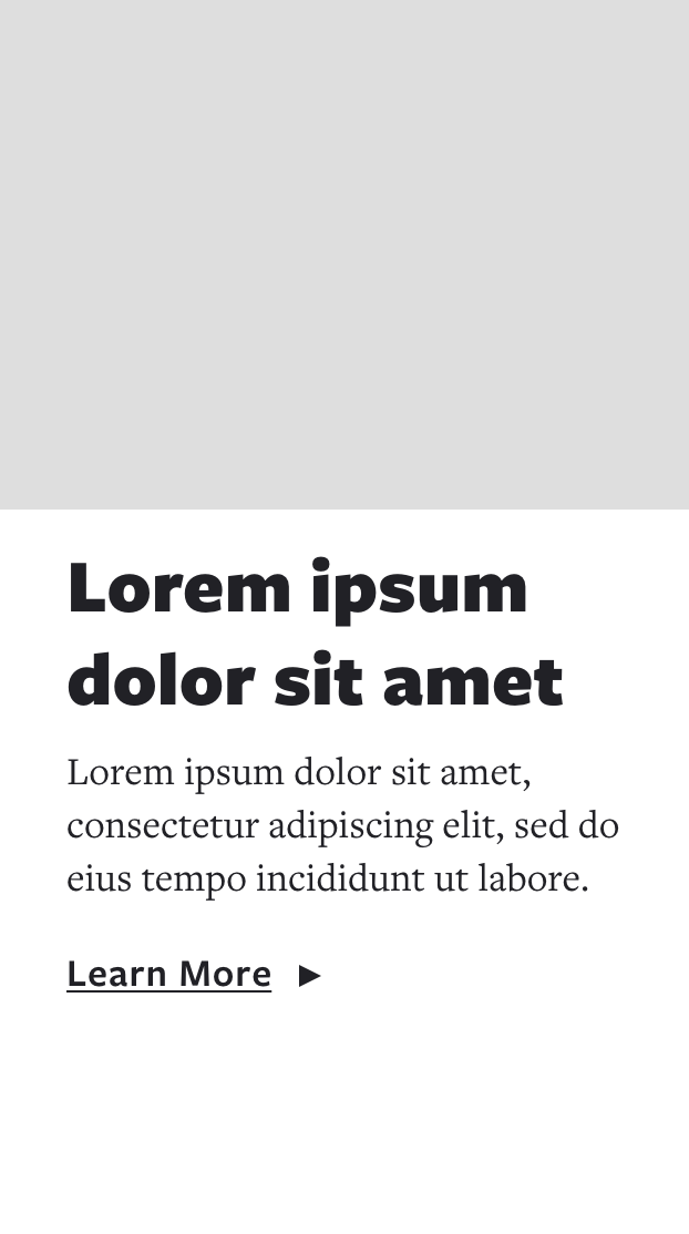
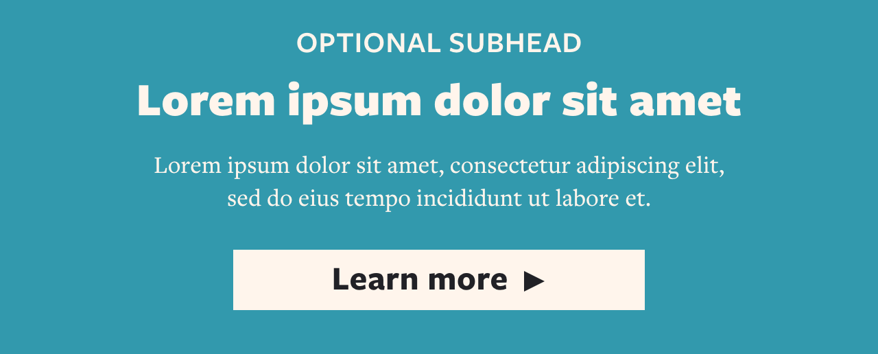
Headers, Footers, and everything in between. Free to mix and match as needed.







Before
Audit Process
Branding
We found a few different logo lockups with various treatments throughout the email program.


Call-to-Action styles
We found several different CTA styles. Different shapes, different colors, and different fonts and letter casing.


Email Best Practices + Accessability
These are just a few of the instances we found where best practices are not being followed. Some, such as small touch targets, could have a serious impact on business goals.

Minimum font size for readability is recommended no smaller than 16px, unless it’s disclaimers and/or legal. We found fonts as small as 12px being used.

This CTA button is 50px high, which is great. However, the touch target (clickable area) is only 17px. The best practice is 44x44 minimum.

There were several instances of either primary messaging and/or CTAs being embedded in images. Live text should be used whenever possible for accessibility.

“View Online” links in the header were only found in a handful of emails and did not include an underline to emphasize the hyperlink.
Art Direction
A few copy and design tweaks could elevate the newsletter templates from being generic, dry, and repetitive. There’s also a big opportunity to remind users that the AJC is the paper of the city.


Stakeholder Interviews
While we reviewed their in-market campaigns, along with a strategist, I led interviews with stakeholders from reporting, design, development, and marketing to define a content hierarchy, design requirements, and audience personalization.
The output was this spreadsheet, which defines messaging requirements from every audience segment per email messaging type.


